A Few of the 2024 Colors of the Year
Editor’s Note: This article was originally published in 2023 and refreshed for accuracy. The 2024 Color of the Year palettes continue to trend strongly and remain excellent choices for new-home design in 2024–2025.
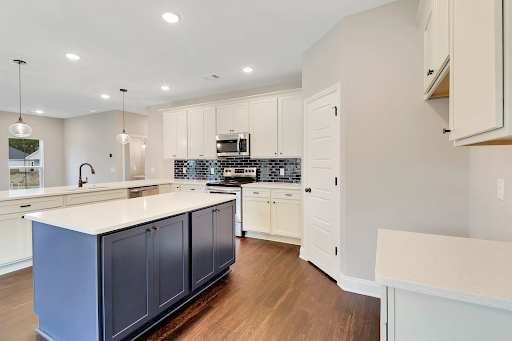
One of the most exciting parts of owning your own Ernest home is designing it! From countertops and flooring to cabinets and hardware, you have endless ways to express your style. Paint color is one of the easiest—and most transformative—ways to personalize your new space.
Each year, major paint companies release their “Color of the Year,” highlighting the shades expected to dominate design trends. For 2024, colors range from moody blues to nature-inspired greens and updated warm neutrals. Here’s a look at the top colors designers can’t stop talking about—and how you can use them in your new Ernest home.
Color Psychology
Color influences mood and emotion, so choosing the right palette can set the tone for your home. Earthy colors like beige, warm white, and taupe create calm. Soft greens evoke balance. Blues communicate relaxation and reflection. The 2024 trends embrace a wide emotional spectrum, giving homeowners more flexibility than ever.
Mastering the Moody Blues
Blue continues to dominate the design world thanks to its versatility and emotional depth. It can be airy and delicate—or rich and dramatic. That range is why it's featured in nearly every “Color of the Year” lineup.
- Benjamin Moore: Blue Nova | A cool, moody blue-purple
“We fell in love with the sumptuous quality, the intrigue… with an undercurrent of reassurance,” said Andrea Magno, Director of Color Marketing.
Works well with: sunny yellow, dusky green, burnt orange - C2: Thermal | A crisp, light sky blue
“Reminds us of a vast blue sky and nature’s infinite array of blues,” notes color expert Philippa Radon.
Works well with: honey neutrals, deep natural greens - Sherwin-Williams: Upward | A soft periwinkle
Calming, clean, and breezy—perfect for serene bedrooms or kitchens.
Works well with: crisp white, beige, icy grey - Valspar: Renew Blue | Ocean-inspired soft blue
Inspired by fog, mist, clouds, and glacier lakes—making it ideal for a coastal Georgia home.
Works well with: icy white, coastal grey, seafoam green
Everlasting Greens
Greens continue their reign as homeowners look to bring nature indoors. These shades feel restorative, grounding, and timeless.
- Graham & Brown: Viridis | A balanced sage green
“Adds depth while blurring the lines between outside and inside,” says the brand.
Works well with: forest greens, botanical hues, crisp white - Dutch Boy: Ironside | A deep olive green
A richer evolution of sage—moody but approachable.
Works well with: antique white, warm beige, dusky blue
The Major Modern Neutrals
Goodbye cold greys—hello warm, cozy neutrals. These trending shades create comfort and pair beautifully with natural textures.
- Glidden: Limitless | A pale, warm yellow
Adaptable and soft—the perfect bridge between modern and classic design.
Works well with: deeper buttery yellows, crisp white - HGTV Home by Sherwin-Williams: Persimmon | A sandy peach
A subtle, modern neutral that feels fresh without overwhelming a space.
Works well with: pearl white, tan, dark grey
Bringing These Colors Into Your Ernest Home
Whether you prefer bold hues or soft subtle tones, our homes are built to serve as a beautiful canvas. From personalizing your finishes in our Design Studio to choosing an available home curated by our expert designers, we’re here to help you bring your dream palette to life.
Explore our communities and floor plans to start visualizing your space—and imagine how these Color of the Year trends can set the tone for your beautiful new home.
Contact us today to get started!
